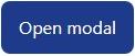
As a button
Code example
<Action
  onClick={() => {
    // your code
  }}
>
  Open modal
</Action>
Result (screenshot)
Button or link? <button> or <a>?
A React component that automatically selects the correct HTML element and ensures accessibility.
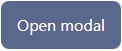
<Action
onClick={() => {
// your code
}}
>
Open modal
</Action><Action
onClick={() => {
// your code
}}
disabled
>
Open modal
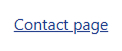
</Action><Action
href="/contacts"
target="_blank"
>
Contact page
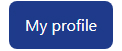
</Action><Action
href="/profile"
variant="button"
>
My profile
</Action>The challenge of choosing the correct semantic element appears in the “button or link in React” scenario, when a link looks like a button or a button looks like a link. When should you use <button>, and when should you use <a>?
There is a simple rule: if clicking an interactive element navigates to another page or another location within the same page, you should use the <a> element.
However, despite this well-known rule, developers often face the dilemma of choosing the correct semantic element.
Using <button> when a link should be used creates obstacles for keyboard navigation and can make screen reader navigation significantly more difficult.
ARIA attributes are sometimes used to compensate for incorrect HTML semantics in buttons and links, but this often creates additional accessibility issues.
Semantics
The component automatically chooses the appropriate semantic element:
Appearance
A separate prop controls the appearance of the element. You do not need to spend time overriding native HTML styles. Instead, you can specify the desired appearance with a single prop. This makes it possible to create a link that looks like a button or a button that looks like a link.
Styles
The component includes built-in styles, but a prop allows you to disable them.
You can also customize the appearance using your own CSS classes.
Disabled
The component provides correct disabled behavior for buttons and links while taking accessibility requirements into account.
Additional props
Separate props allow you to configure link attributes such as target or rel, and also specify the button type (submit or another type).
Fill out the form, and we'll let you know when it becomes available for purchase.